JetBrains Mono leads most short lists for low-strain coding fonts because of its tall x-height, generous letter-spacing, and disambiguated 0/O and 1/l/I shapes. Fira Code and Hack are the two free alternatives that perform almost as well in developer surveys. The right choice depends on screen resolution, ambient light, and personal preference about ligatures. The 15 fonts below cover open-source classics, modern releases tuned for developer eyestrain, two operating-system defaults, and one accessibility-focused face.

A coding font reduces eye strain by doing three things at once. It keeps similar characters visibly distinct so the brain stops re-reading. It uses a high enough x-height that 13 to 16 point text reads at a comfortable size without forced zoom. It pairs with a line-height around 1.4 to 1.6 so adjacent lines do not crowd each other. The font does part of the work; editor settings finish the rest.
Quick-Pick Recommendations by Use Case
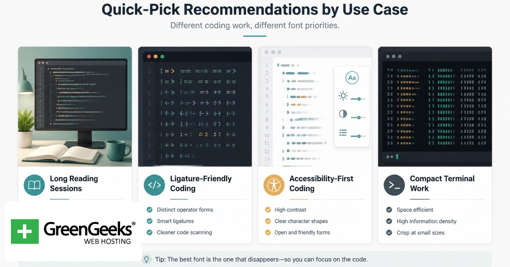
For most developers on a 1080p or higher display, JetBrains Mono at 14 point with line-height 1.5 is the safest default. For readers with low vision or older eyes, Intel One Mono was tuned with a panel of low-vision developers and ships well-disambiguated. For dyslexic readers, Atkinson Hyperlegible Mono and Comic Code outperform standard sans-serif monospaces in informal user reports. For terminal-only work where ligatures are off anyway, Hack and Inconsolata are dependable picks.
| Use Case | Recommended Font | Reason |
| General coding, long sessions | JetBrains Mono | Tall x-height, true italics, disambiguated glyphs |
| Heavy use of ligatures | Fira Code | Largest mainstream ligature catalog |
| Low-vision readers | Intel One Mono | Designed with low-vision developer panel |
| Dyslexic readers | Atkinson Hyperlegible Mono | Letterform distinction by shape, not weight |
Criteria for Eye-Friendly Coding Fonts
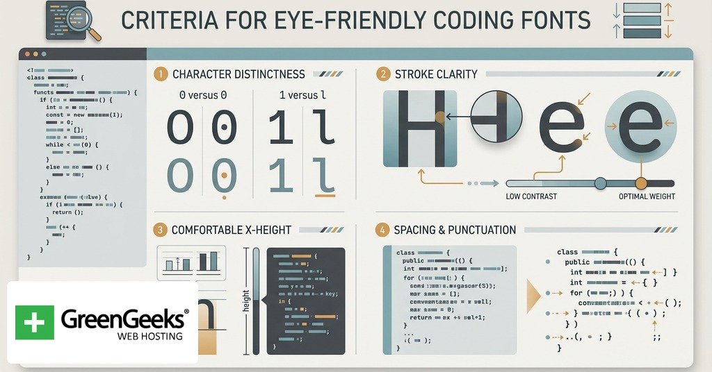
Five attributes separate strong coding fonts from weak ones. The first is x-height. A higher lowercase against a fixed cap height makes 12 point look like 14 point, which lowers the chance of squinting. JetBrains Mono and Victor Mono both push the x-height noticeably above the average monospaced face, and that single decision drives much of how easy they feel during a six-hour stretch.
The second is character disambiguation. The digit 0 should never be confused with the letter O, and the digit 1 should never be confused with lowercase l or capital I. Fonts solve this with slashed zeros, dotted zeros, serifs on the lowercase l, and bowed terminals on capital I. Cascadia Code, IBM Plex Mono, and Source Code Pro use a dotted zero. JetBrains Mono and Fira Code default to a slashed zero. Both work; what matters is that some mark exists.
The third is stroke contrast. Coding fonts with even stroke weight render predictably across rendering engines and zoom levels. Fonts with high contrast between thick and thin strokes (Inconsolata is a mild example) can flicker on subpixel-rendered displays.
The fourth is ligature support, and it cuts both ways. Programmatic ligatures collapse multi-character operators like => and != into single glyphs. For some developers, that reduces parsing effort. For others, it hides the underlying characters and complicates pair programming or terminal SSH sessions. Most modern coding fonts make ligatures optional through OpenType features or editor settings.
The fifth is line-height interaction. A font with tight vertical metrics demands more line-height in the editor; one with loose metrics tolerates 1.3. Per the W3C Text Spacing success criterion (WCAG 2.1, SC 1.4.12), 1.5x is the accessibility floor for paragraphed text, and most coding fonts read best at 1.4 to 1.6.
Comparison Table for the 15 Fonts
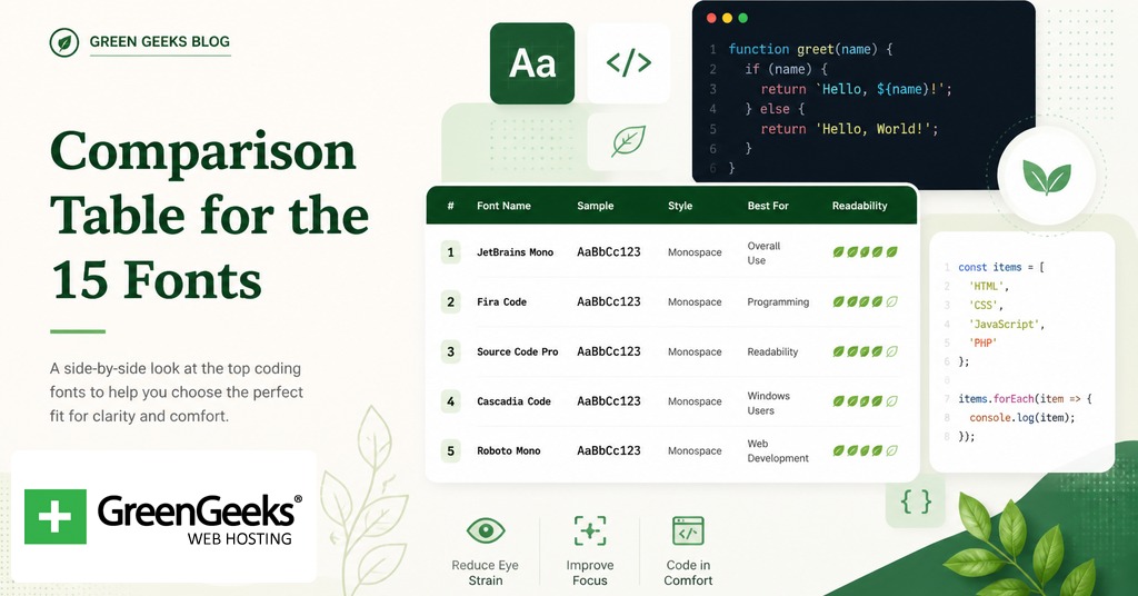
| Font | Designer / Year | License | Ligatures | Distinguishing Trait |
| JetBrains Mono | Philipp Nurullin / 2020 | Apache 2.0 | Yes (142) | Tall x-height, true italics |
| Fira Code | Nikita Prokopov / 2014 | OFL | Yes (large set) | Most popular ligature font |
| Cascadia Code | Aaron Bell / 2019 | OFL | Yes, optional | Default in Windows Terminal, dotted zero |
| Source Code Pro | Paul D. Hunt / 2012 | OFL | No | Adobe’s reference open-source coding face |
| Hack | Chris Simpkins / 2015 | MIT/Bitstream | No | Refined Bitstream Vera derivative |
| Inconsolata | Raph Levien / 2006 | OFL | No | Originally designed for printed code |
| IBM Plex Mono | Mike Abbink / 2017 | OFL | No | Selectric italic references |
| Iosevka | Renzhi Li / 2017 | OFL | Yes, optional | Narrow, programmatically generated |
| Victor Mono | Rune Bjornerass / 2019 | OFL | Yes | Cursive italics, large x-height |
| MonoLisa | Marcus Sterz / 2018 | Commercial | Yes (120+) | Highly customizable through OpenType |
| Ubuntu Mono | Dalton Maag / 2011 | Ubuntu Font Lic. | No | Default on Ubuntu desktop |
| Intel One Mono | Frere-Jones / 2023 | OFL | No | Designed with low-vision developer panel |
| Menlo | Bigelow & Holmes / 2009 | Apple proprietary | No | Default macOS coding font |
| Consolas | Lucas de Groot / 2006 | Microsoft | No | Tuned for ClearType |
| Atkinson Hyperlegible Mono | Braille Institute / 2024 | Free, commercial-OK | No | Letterform-based legibility |
Free and Open-Source Coding Fonts
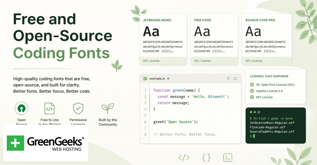
JetBrains Mono
Released in January 2020, JetBrains Mono ships with every JetBrains IDE and downloads as a free Apache 2.0 package. The design philosophy is unusual for a coding font. Philipp Nurullin and the in-house team raised the lowercase letters to roughly 60% of cap height, which is high for a monospaced face, then opened up letter-spacing slightly. The visual result is more white space between glyphs and inside counters, which lowers perceived density. Eight weights (Thin to Extra Bold) ship with true italics rather than oblique slants. The 142 ligatures are off by default and toggle on through OpenType. The slashed zero is on by default and switches off through stylistic set ss19.
Fira Code
Fira Code began as Nikita Prokopov’s personal modification of Mozilla’s Fira Mono in 2014, and the ligature-rich version that most developers recognize stabilized around 2016. The ligature catalog is the largest among free coding fonts, covering arrow operators, comparison chains, and combined symbols common in Haskell, F#, and JavaScript. The base letterforms are humanist rather than geometric, which softens long sessions for some readers and looks too rounded for others. Fira Code is distributed under the SIL Open Font License through GitHub at github.com/tonsky/FiraCode, with stylistic sets cv01 through cv30 controlling alternate glyph shapes.
Cascadia Code
Cascadia Code shipped on September 18, 2019 after a Microsoft Build announcement four months earlier. Aaron Bell of Saja Typeworks designed it for Windows Terminal, and it has become the default coding face in Visual Studio and Visual Studio Code on Windows. Cascadia uses a dotted zero rather than a slashed zero, which some readers prefer because it does not crowd the surrounding glyphs. The 2024 update added Nerd Font icon variants and large-type pieces for retro terminal art. The family splits into Cascadia Code (with ligatures) and Cascadia Mono (without), so users who dislike ligatures get a parallel build with no settings work.
Source Code Pro
Adobe released Source Code Pro on September 24, 2012 as their first open-source coding typeface, designed by Paul D. Hunt. The face has six weights and prioritizes UI work along with code. It does not support ligatures. Its strength is render quality at very small sizes; Source Code Pro at 11 point on a 1080p screen still resolves cleanly where many newer faces blur. The dotted zero is on by default. The font sits under the SIL Open Font License and is hosted on Google Fonts and Adobe Fonts.
Hack
Hack is a 2015 release by Baltimore-based developer Chris Simpkins, built on the Bitstream Vera and DejaVu lineage. It ships in only four styles (regular, bold, italic, bold italic) and does not support ligatures, which keeps the install small. What it does well is character disambiguation: zero, capital O, lowercase l, capital I, and the digit 1 each have visibly different shapes. Hack is available through nearly every package manager (Homebrew, apt, Chocolatey) and as a Nerd Font patch. The repository is at github.com/source-foundry/Hack.
Inconsolata
Raph Levien designed Inconsolata in 2006 with printed code listings in mind, not screens. It is the oldest font on this list and shows its age in tighter letter-spacing than the post-2015 cohort. The trade-off is character. Inconsolata has subtle stroke-contrast variation that gives it an editorial feel rare in monospaced faces. Levien later turned it into a variable font available through Google Fonts, so weight tuning is now per-pixel rather than per-style. No ligatures.
IBM Plex Mono
IBM Plex Mono is the monospaced cut of the Plex superfamily that Mike Abbink and Bold Monday released in 2017. The italic forms borrow from the IBM Selectric Italic 12 typewriter element, especially the italic i, j, t, and x with their flag-shaped terminals. Plex Mono uses a dotted zero and has eight weights with paired italics. It does not support ligatures, but the family integrates well with IBM Plex Sans for documentation projects where prose and code share a page. License is SIL Open Font, available at fonts.google.com and the IBM Plex site.
Iosevka
Iosevka is procedurally generated. Renzhi Li (be5invis) wrote it as code that produces glyphs, which means users can build custom variants by editing a configuration file and running a build. The default Iosevka is narrower than most monospaced faces, which fits more characters per line on portrait monitors and matters for users with split-view setups. Six monospace subfamilies (sans-serif and slab-serif at three spacings each), nine weights, and 19 stylistic sets ship in the standard build. Released 2017, SIL Open Font License. Documentation lives at typeof.net/Iosevka.
Victor Mono
Norwegian designer Rune Bjornerass released Victor Mono in 2019. The headline feature is the cursive italic, which is semi-connected and visually closer to handwritten script than to a slanted Roman. For developers who use italic for comments or string literals in their syntax highlighting, the cursive italic creates an obvious visual layer separation without changing color. Victor Mono has a large x-height, narrow proportions, and seven weights. Ligatures ship enabled. SIL Open Font License via rubjo.github.io/victor-mono.
MonoLisa
MonoLisa is a paid font. Marcus Sterz at FaceType in Vienna released the first commercial version in 2018, then refined it through versions 1.6 (November 2020) and 2.x. Pricing runs per seat for individual developers and per team for companies. The pitch is OpenType depth: 120-plus ligatures, character variants for most letterforms, alternate styles for the lowercase a, g, and l. For developers who spend full workdays in code and treat the editor as their primary tool, the polish difference between MonoLisa and a free alternative is real but not categorically different from JetBrains Mono.
Ubuntu Mono
Dalton Maag designed the Ubuntu Mono face for Canonical, and it shipped as the default Ubuntu desktop monospaced font in October 2011 with Ubuntu 11.10. It is the rare humanist-leaning monospaced face that does not feel cramped. The lowercase a has a double-story form. Ubuntu Mono carries an Ubuntu Font License rather than an SIL OFL license, so commercial redistribution differs slightly. No ligature support. Available through fonts.google.com and design.ubuntu.com.
Intel One Mono
Intel released Intel One Mono in 2023 under the SIL Open Font License, with Frere-Jones Type doing the design work. The development process is the part worth noting: Intel convened a panel of low-vision developers and tested glyph variants against their reading reports. The result is a monospaced face with extremely high stroke contrast disambiguation, exaggerated terminals on confusable characters, and tighter horizontal metrics than most 2020s releases. No ligatures. Source at github.com/intel/intel-one-mono.
System Defaults Worth Knowing
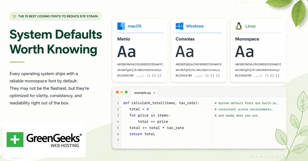
Menlo
Apple commissioned Jim Lyles and Charles Bigelow to draw Menlo, which shipped as the macOS default monospaced face with Snow Leopard in August 2009. Menlo derives from Bitstream Vera Sans Mono. It is competent rather than exceptional, with adequate disambiguation and a slightly lower x-height than newer alternatives. For macOS developers who do not want to install anything, it remains a workable default at 14 point with line-height 1.5.
Consolas
Lucas de Groot designed Consolas around 2006 as part of Microsoft’s ClearType font family. It has been a default in Visual Studio and other Microsoft developer tools for nearly two decades. The slashed zero, the squared-off bowls, and the slight tightness of vertical metrics all serve subpixel rendering on Windows. On macOS Retina or Linux greyscale rendering, Consolas can look heavier than intended. It pairs poorly with very small font sizes; readers prone to strain should use 14 point or larger.
Accessibility-Focused Choices
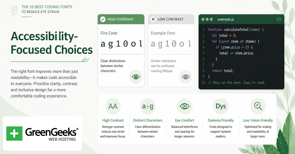
Atkinson Hyperlegible Mono
The Braille Institute released Atkinson Hyperlegible in 2020 (proportional) and the monospaced and Next variants through 2024. The design rule is letterform distinction by shape, not by weight. Where OpenDyslexic adds bottom-weighted thickening to anchor letters, Atkinson Hyperlegible draws each confusable pair with structurally different forms. The capital I has serifs; the lowercase l has a tail; the digit 1 has a base. The mono variant is free for commercial use through brailleinstitute.org/freefont.
Two adjacent options worth knowing: OpenDyslexic by Abbie Gonzalez is a proportional dyslexia-targeted face that some IDEs allow for source code despite not being monospaced; Comic Code by Toshi Omagari is a monospaced take on Comic Sans, designed partly to feel less intimidating, including for some dyslexic readers. Both sit outside the numbered 15 but belong in the conversation.
Editor Settings That Compound or Undo Your Font Choice
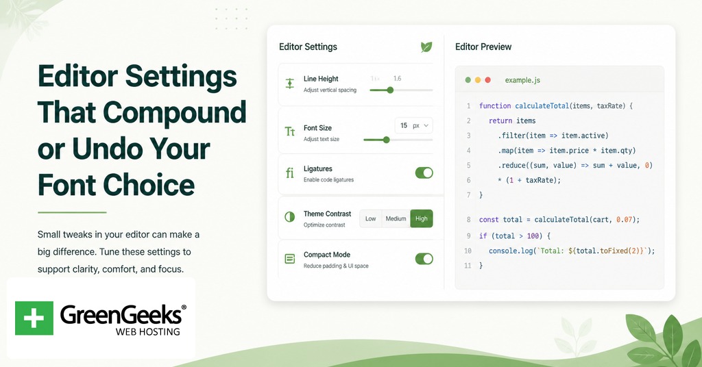
A high-x-height font at the wrong size and line-height feels worse than a mediocre font at the right ones. Five settings carry the weight.
Font size. 13 to 14 point at 1080p, 15 to 16 point at 1440p, 16 to 18 point for readers with eyestrain or older vision.
Line-height. 1.4 to 1.6 of font size for code; below 1.3 crowds; above 1.7 fragments.
Letter-spacing. Most coding fonts ship with metrics close to ideal. Override only if a font feels cramped at your chosen size.
Anti-aliasing. macOS uses greyscale; Windows uses ClearType subpixel. Fonts tuned for one engine look heavier or lighter on the other. Test before committing.
Ligature toggle. On if the operators in your stack benefit from collapsed glyphs. Off for terminal SSH or pair programming where the underlying characters matter.
Theme contrast and ambient lighting interact with the font as well. A dark theme in a bright room produces halation around bright glyphs, which is a frequent complaint among developers with astigmatism. A light theme in a dim room produces brightness fatigue. Match the theme to the room rather than to a fixed preference, and prefer themes with foreground colors slightly off pure white or black to soften contrast.
Installation and Setup Notes
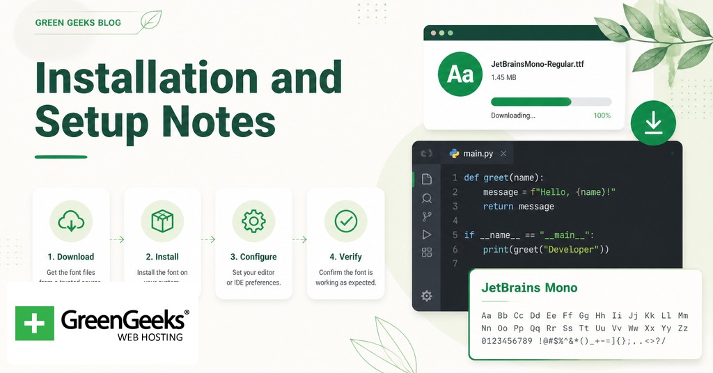
Most coding fonts download as TTF or OTF files from GitHub releases or the foundry’s site. On macOS, double-click the file and select Install Font. On Windows, right-click the file and select Install for all users. On Linux, copy the files to ~/.local/share/fonts and run fc-cache -f -v.
To set the font in Visual Studio Code, open settings (Cmd or Ctrl plus comma), search for editor.fontFamily, and set the value to the font name with fallbacks: “JetBrains Mono”, “Fira Code”, monospace. Set editor.fontSize separately. To enable ligatures, set editor.fontLigatures to true.
In JetBrains IDEs (IntelliJ, PyCharm, WebStorm), open Preferences, then Editor, then Font, and select the font from the dropdown. Ligatures toggle in the same panel.
In Vim or Neovim run inside a terminal, the terminal application controls the font (Terminal.app, iTerm2, Windows Terminal, Alacritty). Set the font there, not in Vim. For GUI builds (MacVim, gVim, Neovide), set guifont in the configuration file.
Nerd Font patched variants add icons for status-bar plugins and prompt themes. The Nerd Fonts project at nerdfonts.com ships patched versions of most fonts on this list, so a developer who wants both eye-friendly metrics and icon support can usually combine them in a single build.
Frequently Asked Questions
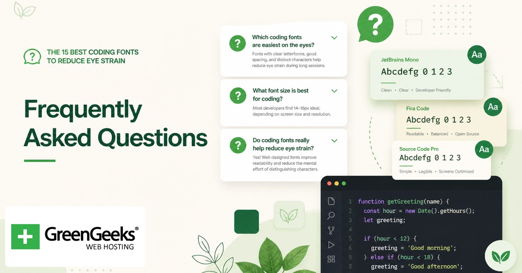
What font size should I use for coding?
13 to 14 point is the common recommendation at 1080p resolution; 15 to 16 point at 1440p or higher. Developers prone to eyestrain should move to 16 to 18 point regardless of resolution. The cost in lines visible per screen is small and the savings in self-reported fatigue are reported as material in developer ergonomics surveys.
Are coding ligatures good or bad for readability?
Ligatures collapse multi-character operators like => and != into single glyphs, which can lower the parsing effort for some readers and hide the underlying characters for others. Most coding fonts that support ligatures keep them off by default and expose them through OpenType or an editor setting. Try them for a week; turn them off if you find yourself second-guessing what the original characters were.
Is Fira Code or JetBrains Mono better?
Both are strong free options. Fira Code has the larger ligature catalog and a more humanist letterform with softer curves. JetBrains Mono has the higher x-height, a tighter overall rhythm, and ships with true italics rather than oblique. Readers who care most about ligature coverage tend to pick Fira Code; readers who care most about character size at small point sizes tend to pick JetBrains Mono.
Is dark mode or light mode better for coding eye strain?
Neither wins universally. Dark themes can produce halation (the appearance of bright text bleeding into a dark background) for readers with astigmatism, while light themes can fatigue eyes in dim rooms. Match the theme to the ambient light level and prefer foreground colors slightly off pure white or black to soften contrast.
What font is most readable for people with dyslexia?
Atkinson Hyperlegible Mono, Comic Code, and OpenDyslexic are the three most-cited options. Atkinson Hyperlegible focuses on letterform distinction (different shapes for I, l, 1, and for 0, O); Comic Code uses Comic Sans-derived shapes that reduce reversal confusion between b, d, p, and q; OpenDyslexic adds bottom-weighted thickening as an anchor cue. Test all three; preferences vary substantially among dyslexic readers.