Sometimes viewing content from a website on mobile will give you a much different experience. This could be good or bad, depending on the situation. However, many sites are trying to show specific content on mobile now.
There is actually a really easy way to show a WordPress page in mobile-specific content. You don’t have to mess with any code, you simply need to have the right tools and be willing to do a little editing.
Let’s take a look at how to show specific content for mobile devices. This will allow your WordPress users the ability to see and experience things differently when looking at a mobile page or post from your website.
Why Show Specific Content on Mobile
Mobile specific layouts of posts and pages have started to become very relevant. Google actually introduced AMP a while back. While that is more for search optimization, they did set a stone in motion for website owners to start being more mindful of how their content is displayed on mobile units.
Most pages and posts in the mobile version of WordPress will automatically display properly because of the theme. Most of the better WordPress themes are mobile-friendly and responsive.
That being said, there may be some posts and pages that are just too packed with content for mobile users in WordPress to view the right way.
Another thing to think about is that you may want to display different versions of the same page or post on mobile devices for different reasons. It could be that you want a different style or look, or that you want the information to be different just because of the device being used.
Instead of having to worry about a bunch of code, I have found a great plugin that will allow you to edit your regular pages and posts to create mobile versions of them to display.
This plugin gives you the ability to easily show specific content on mobile. Let’s take a look at the plugin together.
Specific Content for Mobile
The Specific Content for Mobile plugin allows you to easily create specific pages and posts for mobile users in WordPress. This is a great plugin if you want to add, remove, or redesign specific content to show differently based on mobile versions.
There are some rules you will have to play within, but overall, the Specific Content for Mobile plugin will give you the option to successfully create different versions of pages and posts for hand-held viewing.
The plugin is actually very lightweight, and according to the author, is compatible with the Gutenberg block editor, the classic editor, and all WordPress page builders.
Let’s take a look at how to install and activate the plugin, as well as how to use it.
Note: Before moving on, please remember that this plugin supports mobile versions of posts and pages. It does not support custom post types, archives, or terms.
Install and Activate Plugin
In order to split your posts and pages and start showing specific content for mobile devices, you first need to install and activate the plugin. You can do this by going to the plugins page located in the WordPress admin dashboard. Just search the plugin name and it will come up.
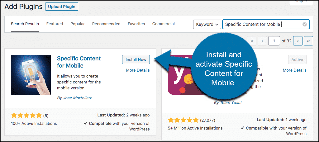
Once the plugin has been installed and activated, you will automatically be redirected to your list of plugins.
However, the plugin has now added a tab for mobile versions of posts and pages. This tab is located within the editor.
Let’s take a look at how to get there and what you need to do to show mobile-device content to your WordPress users.
Edit Posts and Pages to Show Specific Content in Mobile
As stated above, the plugin is very lightweight and ready to roll out of the box. Basically, there isn’t a main settings page for the plugin. It simply adds an editing tab and/or button within the posts and page editing area of your WordPress admin dashboard.
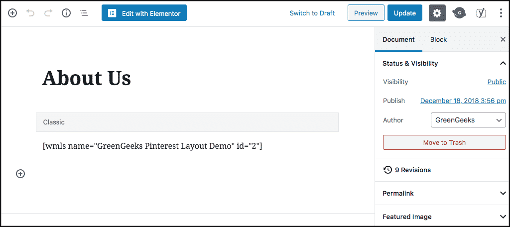
To access your pages, click on Pages > All Pages. This will take you to all the pages you have in your admin area.
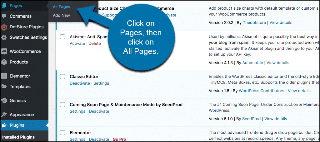
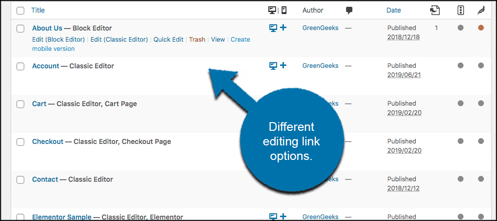
Now you are in the Pages section of your admin area. Scroll over the page you want to edit. You will see a selection of editing options come up. These will depend on what you have installed.
You can see in the screenshot below that I have both the block editor and the classic editor installed. You will also notice that now there is an option to “create a mobile version” of the page in question.
So, you can click on that link, or click on either the block or classic editor link. The one you choose is just simply for you to edit the page to show for mobile WordPress users.
For this example, we are going to use the block editor. So we have clicked on that link and now the relevant page is open. This page is the current version showing for both desktop and mobile users.
Scroll down some to the bottom right of the page. You see there is a dropdown tab now titled “Mobile version.” Click on the “Create Mobile Version” button located within that dropdown.
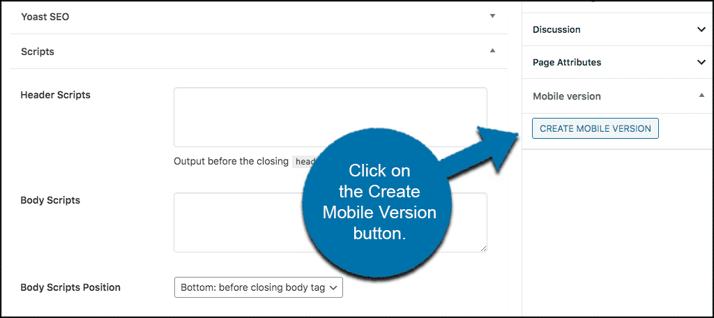
What happens is that a copy of the page is created that is for mobile viewing only. You can now edit this page how you would like. All the edits you make will be available for those who are using mobile to read your site.
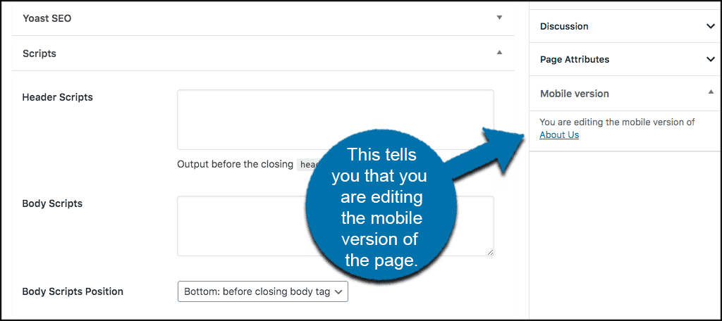
You will know you are editing the mobile version because the dropdown mobile menu area will inform you.
Edit the page however you would like. When you are finished, simply click on the “Publish” button to make the mobile version of the page live.
For confirmation, click out of the editing portion and now look at the page list in your admin area. You will see that a mobile version of the page has been created and is now there to edit whenever you need.

That’s it! You have successfully created specific content for mobile users. You can do this for any page you want.
Note: The process is exactly the same for posts. Simply go to the posts section of your dashboard and edit any posts for mobile readers that you want.
Final Thoughts
Creating specific content for mobile devices can be an important aspect of site design and configuration. This is especially true if you are trying to show different items or information based on the type of device someone is accessing your website with. Mobile access to websites has continued to increase over time. It is important that you give people a good view of your WordPress content.
Aside from using AMP to modify how your site shows (which is actually a different process altogether), creating specific content for mobile users is a great way to allow site visitors to easily view content on those units the way you intended it to be.
Have you been using a different plugin to accomplish this? Do you find that layout and styles look better on the mobile versions of WordPress pages and posts you have created?
Hi
When I create a mobile version of an article, there are now two articles that appear – how do I make it so that only the desktop article is visible on desktop, and only the mobile article is visible on mobile?
Thank you
Will
Hello. The mobile version of the page should be pulled automatically when WordPress detects a mobile device. You may have to contact the developer should this not be the case. As far as I understand it, the plugin should work like AMP.