Inter, Roboto, and Open Sans are the most-used Google Fonts on the open web because they were drawn for screens, ship in many weights, and carry an open license that allows commercial embedding. The 25 picks below extend that core into serif, slab, condensed, monospace, and accessibility-tuned territory, so a designer can build an entire site, from hero headlines to footnotes to code samples, without leaving the Google Fonts directory. The criteria are usage data, weight count, optical sizing, language coverage, and how each face holds up at body sizes on a 16px baseline.

The Google Fonts library held 1,826 families in May 2025 and counted more than 50 trillion all-time views across 50 million websites. Roboto leads cumulative views at roughly 28 trillion, while Inter recorded 414 billion views in the year ending May 2025, growing 57% year-on-year. Those two numbers explain why most modern interfaces feel familiar. The list below treats them as the spine and adds 23 more faces that solve different problems: editorial headers, accessibility, code, branding.
Selection Criteria for the 25 Picks
Five inputs shaped the shortlist. The first was real usage. Faces with at least a billion annual views on Google Fonts moved up, since wide adoption usually correlates with rendering quality across browsers and operating systems. The second was weight count. Fonts that ship with five or more weights give designers room for hierarchy without dropping in a second family. The third was optical sizing or screen tuning. Inter, Roboto, Lexend, and Atkinson Hyperlegible were drawn with on-screen pixel rendering as the explicit goal, which shows in how they survive small body sizes.
The fourth input was language coverage. Latin alone covers most English-language sites, but Latin Extended, Cyrillic, and Greek matter for international UX. PT Serif, Open Sans, EB Garamond, and Atkinson Hyperlegible all carry strong multi-script support. The fifth was the file size after subsetting. A variable font on Google Fonts typically lands between 20KB and 30KB once a Latin subset is applied, against 400 to 800KB for the equivalent set of static files. That gap matters for Largest Contentful Paint scores on mobile.
License terms were a baseline filter. Every font on the list ships under either the SIL Open Font License or Apache 2.0, which both permit commercial use, modification, and embedding. None of the fonts below requires attribution in the rendered page, though the OFL does ask that copies of the font carry the original notice.
Master Comparison Table
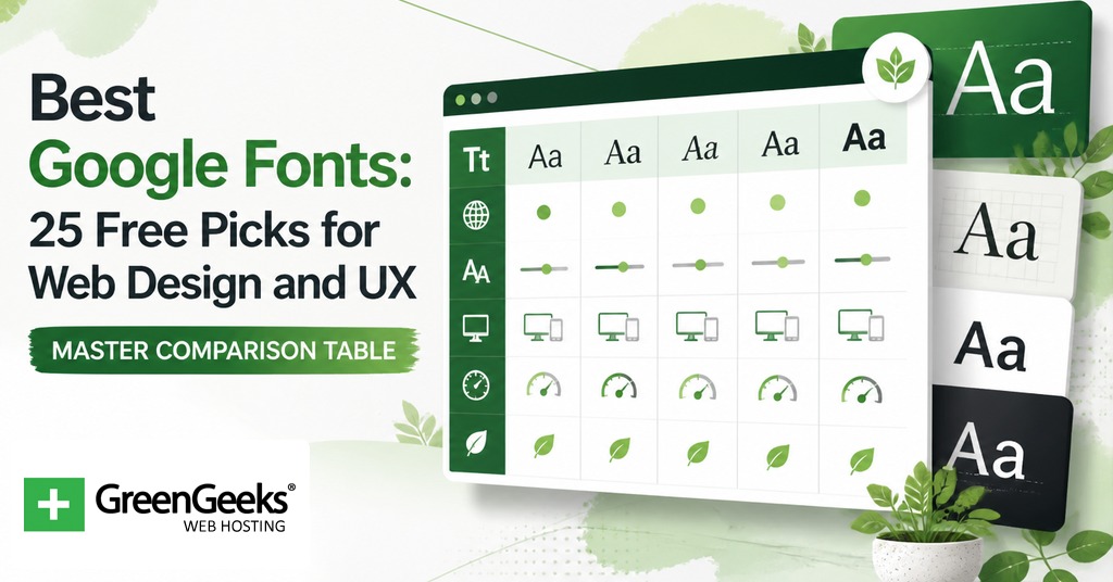
| Font | Classification | Weights | Variable Axis | Best For |
| Inter | Neo-grotesque sans | 9 | Weight, optical size | Body, UI |
| Roboto | Neo-grotesque sans | 6 | Weight, width (Flex) | Body, UI |
| Open Sans | Humanist sans | 7 | Weight | Body, blog |
| Lato | Humanist sans | 9 | Static only | Body, brand |
| Source Sans 3 | Humanist sans | 8 | Weight | Body, docs |
| Work Sans | Sans, screen-tuned | 9 | Weight | Body, UI |
| Nunito | Rounded sans | 7 | Weight | Friendly UI |
| DM Sans | Geometric sans | 5 | Weight, optical size | Small text |
| Montserrat | Geometric sans | 9 | Weight | Headers, brand |
| Poppins | Geometric sans | 9 | Static only | Headers, brand |
| Plus Jakarta Sans | Geometric sans | 6 | Weight | SaaS UI |
| Manrope | Geometric sans | 7 | Weight | SaaS UI |
| Bebas Neue | Condensed display | 1 | Static only | Posters, hero |
| Oswald | Condensed sans | 6 | Weight | News headers |
| Archivo | Sans, gothic | 9 | Weight, width | Editorial |
| Raleway | Sans display | 9 | Weight | Brand, hero |
| Space Grotesk | Proportional sans | 5 | Weight | Tech brand |
| Merriweather | Slab-serif body | 4 | Static only | Long-form body |
| Lora | Calligraphic serif | 4 | Weight | Editorial body |
| PT Serif | Transitional serif | 2 | Static only | Multi-script body |
| Playfair Display | Transitional display serif | 6 | Weight | Editorial header |
| DM Serif Display | High-contrast serif | 1 | Static only | Hero header |
| EB Garamond | Old-style serif | 5 | Weight | Long-form reading |
| Roboto Slab | Slab serif | 9 | Weight | Headers with body link |
| JetBrains Mono | Monospace | 8 | Weight | Code blocks |
Sans-Serif Workhorses for Body and UI
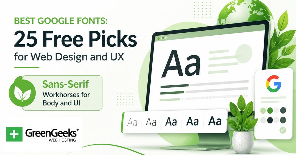
These eight faces handle paragraph copy, navigation labels, form fields, and most interface text. They share three qualities that make them safe defaults: a generous x-height, even spacing, and rendering hinted for low-resolution screens.
1. Inter
Drawn by Rasmus Andersson and released in 2017, Inter is a neo-grotesque sans-serif tuned for user interface text at small sizes. The variable file carries both a weight axis (100 to 900) and an optical size axis with three master designs at 100, 400, and 900. Inter is the default in several major design systems and recorded 414 billion Google Fonts views in the year ending May 2025.
Pairs cleanly with itself. A single Inter file at variable weight covers headers, body, and UI without a second family.
2. Roboto
Christian Robertson designed Roboto for Android 4.0 in 2011. It ships in Thin, Light, Regular, Medium, Bold, and Black, plus oblique versions, and gained a variable counterpart, Roboto Flex, in 2022. Roboto holds the most all-time Google Fonts views at roughly 28 trillion. Its dual character, geometric skeleton with humanist curves, gives it a neutrality that adapts to most product contexts.
Sample pairing: Roboto for body, Roboto Slab for H1.
3. Open Sans
Open Sans is a humanist sans-serif that Steve Matteson drew under commission from Google in 2011. The character set covers 897 glyphs across Latin, Greek, and Cyrillic. It carries open letterforms and a slightly upright stress that keeps long paragraphs readable on small screens.
Designer note: Matteson based the family on his earlier Droid Sans, drawn for Android in 2008.
4. Lato
Lato is a humanist sans designed by Polish type designer Lukasz Dziedzic and released in 2010. It ships in 9 weights with matching italics. The face carries semi-rounded letterforms that read as warm without losing structural rigor.
Common use: corporate sites and education platforms that want a friendlier alternative to Roboto.
5. Source Sans 3
Adobe’s first open-source typeface, drawn by Paul Hunt and released in 2012 as Source Sans Pro. Source Sans 3 is the renamed open-source successor. The face ships in 8 weights from ExtraLight to Black with matching italics. Letterforms are clean and slightly narrow, so it sets compactly without feeling condensed.
Use it where documentation density matters, like API references or product docs.
6. Work Sans
A screen-tuned sans by Wei Huang. The middle weights (400 to 600) are drawn for sizes from about 14px to 48px. The lighter and heavier weights have more decorative cuts, so designers can grade up to display use without changing family.
7. Nunito
Vernon Adams designed Nunito as a rounded-terminal sans-serif. The rounded corners give the face a softer feel than Inter or Roboto. Nunito Sans, the non-rounded version, lives alongside it in the Google Fonts directory for cases where the soft terminals read as too playful.
Pairs with Lora for a friendly editorial blog system.
8. DM Sans
DM Sans is a low-contrast geometric sans by Colophon Foundry and Indian Type Foundry. The face is intended for small text sizes and ships with a variable file that carries a weight axis and optical size axis. The tighter spacing reads well in dense UI panels and dashboards.
Geometric Sans Display Faces
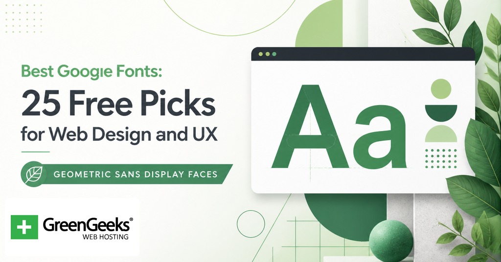
This group leans toward branding and headers. The geometry gives a confident, modern impression. Body use is possible but the open counters can feel airy in long passages.
9. Montserrat
Julieta Ulanovsky drew Montserrat in 2011, inspired by old posters and signs in the Montserrat neighborhood of Buenos Aires. The family ships in 9 weights. The geometric construction makes it a frequent pick for hero headers, brand marks, and presentation slides.
A note from usage data: Montserrat has been one of the top three Google Fonts for the last five years running.
10. Poppins
A geometric sans from Indian Type Foundry, with Jonny Pinhorn and Ninad Kale credited. Poppins covers Latin and Devanagari, which is rare among Google Fonts. It ships in 9 weights from Thin to Black. Its letterforms are nearly monolinear, which gives a clean, marketing-page look.
Sample pairing: Poppins for headers, PT Serif for body.
11. Plus Jakarta Sans
Designed by Gumpita Rahayu of Tokotype. Released as a SaaS-friendly geometric sans, the family has gained traction in startup and product UI contexts where Inter feels overused. Six weights with matching italics.
12. Manrope
Mikhail Sharanda’s Manrope sits between geometric and grotesque. Closer in spirit to commercial faces such as Circular, it has slightly closed counters that prevent the geometric letters from feeling too open at large sizes. Seven weights.
Condensed and Bold Display Sans
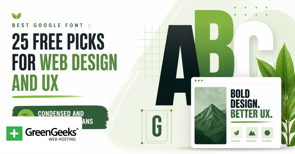
For posters, hero sections, and short blocks of high-impact type. None of these three is intended for paragraph use.
13. Bebas Neue
Designed by Ryoichi Tsunekawa and added to Google Fonts in 2018, Bebas Neue is uppercase-only and condensed. The Google Fonts version ships in a single weight. Bebas Neue Pro, sold separately, adds lowercase, but most editorial usage of Bebas Neue treats it as an all-caps poster face.
14. Oswald
Vernon Adams reworked the Alternate Gothic style to create Oswald. The family ships in 6 weights with full lowercase, which differentiates it from Bebas Neue. Oswald works for news mastheads, sports site headers, and any layout that wants vertical compression.
15. Archivo
Archivo draws from 19th-century American gothic type. The Google Fonts release ships with both weight and width axes as a variable font. The condensed widths read as editorial; the regular widths read as utility sans for forms and dense tables.
Distinctive and Geometric Sans Picks
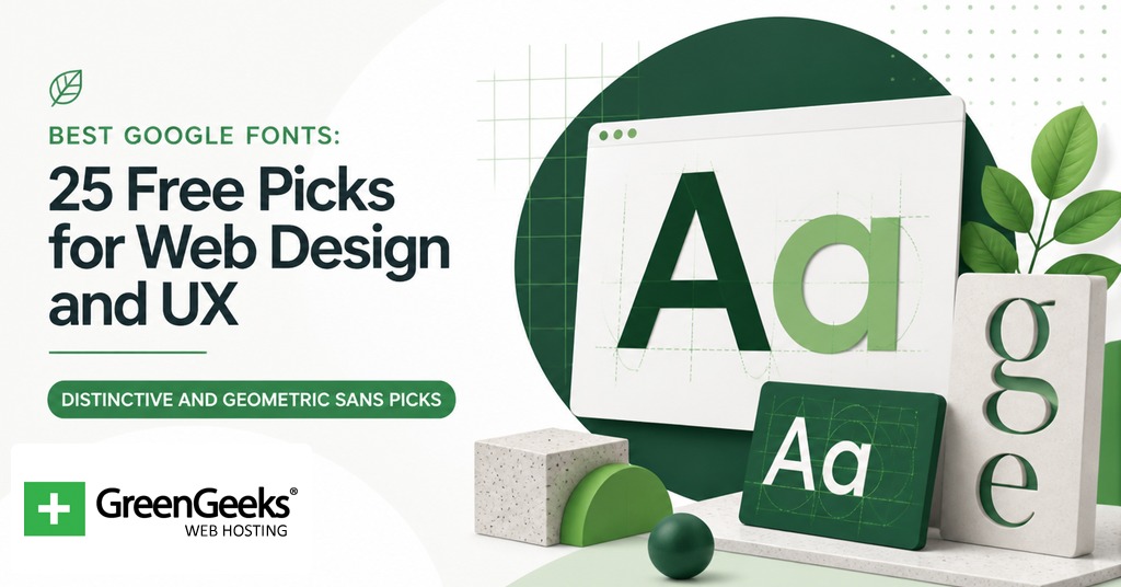
Two faces that solve narrower problems than the workhorses but appear repeatedly in modern brand systems.
16. Raleway
Originally drawn by Matt McInerney as a single thin display weight in 2010. Pablo Impallari and Rodrigo Fuenzalida later expanded the family to 9 weights with italics. Raleway is best at large sizes; the thin and extralight weights have signature ligatures and a slightly Art Deco geometry.
17. Space Grotesk
Florian Karsten released Space Grotesk in 2018 as a proportional sans derived from Colophon Foundry’s monospace Space Mono (2016). The family retains the monospace’s idiosyncratic curves and angled cuts but optimizes spacing for non-display sizes. Five weights, no italics. It reads as tech-forward without crossing into the science-fiction look of fully geometric faces.
Serifs Built for Screen Reading
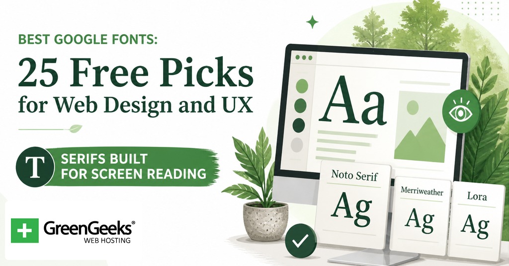
Three serifs that survive the move from print to screen. Each carries a high x-height and slightly open letterforms that hold up on phone screens.
18. Merriweather
Sorkin Type drew Merriweather as a screen-reading serif. The face has a large x-height, slightly condensed letterforms, and very open apertures. It is one of the most-cited body serifs for blogs and publications. Four weights from Light to Black.
19. Lora
A contemporary serif with calligraphic roots from Cyreal. Lora is featured on more than 1.5 million websites by recent counts. It carries enough warmth to read as editorial without losing the regularity needed for paragraph copy. Four weights with matching italics.
20. PT Serif
ParaType’s PT Serif ships with Latin, Central European, and Cyrillic character sets. The family is metric-paired with PT Sans, which means the two families share line heights and proportions, so they swap cleanly within a system. Two weights with italics, plus two caption styles.
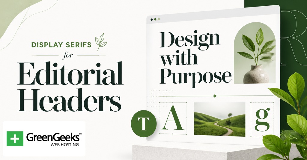
Display Serifs for Editorial Headers
These faces shine at 32px and above. None of them are body-text candidates.
21. Playfair Display
A transitional serif by Claus Eggers Sorensen. The design references 18th-century European type and ships in 6 weights. The high stroke contrast and tall ascenders give it the editorial feel of a fashion magazine header. Most pairings put Playfair Display against a clean humanist sans for body.
22. DM Serif Display
A high-contrast transitional face shaped for poster and hero setting. The serifs are delicate, the stroke contrast is severe, and the letterforms hold their shape only at large sizes. Single weight on the Google Fonts release, plus an italic. Use at 40px or larger.
23. EB Garamond
Georg Mayr-Duffner drew EB Garamond as a free, scholarly revival of Claude Garamond’s 16th-century types. Five weights with matching italics. The family supports Latin, Greek, and Cyrillic. Designers reach for it when a long-form reading context wants a literary register.
Slab Serif and Monospace Picks
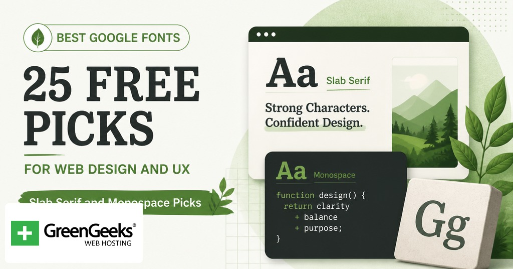
Two faces that round out the system: a slab for the gap between sans and serif, and a monospace for code samples.
24. Roboto Slab
A slab serif version of Roboto, released in March 2013 as the default font for Google Keep. The family ships in 9 weights from Thin to Black. Its primary use is as a header companion to Roboto body, where the matching skeleton gives a tight visual relationship.
25. JetBrains Mono
JetBrains released JetBrains Mono in 2020 under the SIL Open Font License. The face was drawn for code editors with maximized lowercase height for clarity at 12 to 14px sizes. Eight weights with italics. Embedded in any documentation site or developer-focused product, it gives code blocks a deliberate, engineered feel.
Pairing Principles for Header and Body
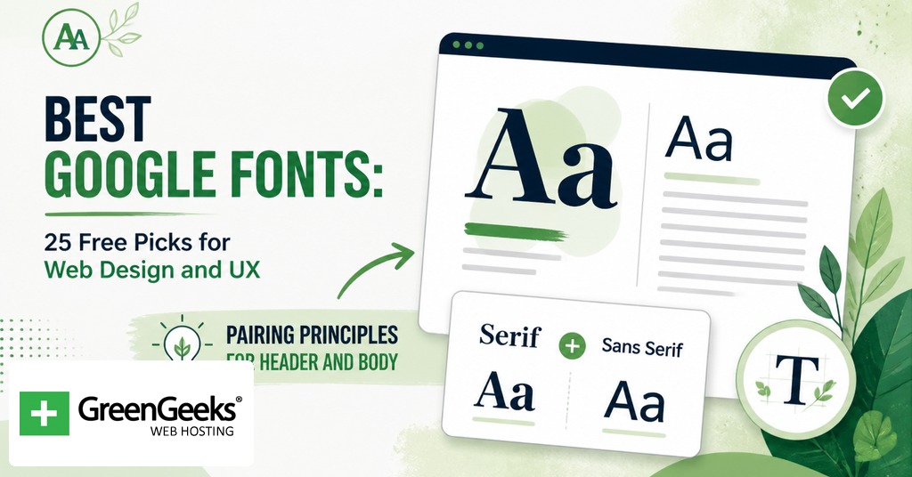
Two-face systems tend to win. Most production sites use one display face for H1 and H2, and one workhorse for body, navigation, and UI. A third face is sometimes added for code or numerals, but past three the page starts to feel inconsistent.
Strong pairings work on contrast. Pair a high-contrast serif with a low-contrast sans. Pair a geometric sans with a humanist serif. Pair a condensed display with an extended workhorse. Same-mood pairings usually fail because the page loses hierarchy. Three reliable pairings from the list above are Playfair Display with Source Sans 3, Montserrat with Merriweather, and Inter with itself at varying weights.
X-height matching is the second rule. If the body face has a tall x-height and the header face is short, the body type will look bigger than the headers at equal pixel sizes. PT Serif and PT Sans were designed together specifically to solve this. Inter and Roboto Slab share enough proportional DNA to behave the same way. When pairing across foundries, set both faces side by side at the intended sizes and check the optical balance before shipping.
A third rule worth keeping is to limit weights. Use no more than three weights per face on any single page. A typical setup is Regular for body, Medium for emphasis, and Bold for headers. Adding more weights does not increase clarity; it dilutes hierarchy.
Loading Google Fonts on a Website
There are two ways to load a Google Font from the Google CDN, plus a third route that self-hosts the same files. Each has tradeoffs for performance, privacy, and caching. The implementation steps below cover all three.
Pick the font and weights on fonts.google.com and copy the generated link tag.
Paste the link tag into the head of the HTML, before the main stylesheet.
Reference the font in CSS using the font-family declaration.
Add font-display: swap to the @font-face block (or rely on Google’s default, which already includes swap).
For a self-hosted setup, download the font files from the Google Fonts download button, place them in a /fonts directory, and write the @font-face block by hand.
Add a rel=preload link tag for the most-used font file to remove layout movement on first paint.
The link-tag approach looks like this:
<link rel="preconnect" href="https://fonts.googleapis.com"> <link rel="preconnect" href="https://fonts.gstatic.com" crossorigin> <link href="https://fonts.googleapis.com/css2?family=Inter:wght@400;600;700&display=swap" rel="stylesheet">
The CSS @import alternative loads the same files but blocks render until the import resolves:
@import url('https://fonts.googleapis.com/css2?family=Inter:wght@400;600;700&display=swap'); body { font-family: 'Inter', system-ui, sans-serif; }
A self-hosted block looks like this and removes the third-party request entirely:
@font-face { font-family: 'Inter'; src: url('/fonts/inter-variable.woff2') format('woff2-variations'); font-weight: 100 900; font-display: swap; }
Pair the self-hosted block with a preload tag in the document head for the file in question, and the page hits first paint with the webfont rendered, no fallback flash.
Performance and Privacy Considerations
A variable font replaces 4 to 9 static files with one. After Latin subsetting, a typical variable Google Font lands between 20KB and 30KB, against 400 to 800KB for the static-file equivalent. That payload reduction shows up directly in Largest Contentful Paint on mobile networks. For a site that needs only the Latin subset, applying the text URL parameter on the Google Fonts request, or running pyftsubset on a self-hosted file, drops file size by a further 70 to 90 percent.
The font-display CSS property controls what happens while the file is in flight. Setting font-display: swap renders the fallback immediately and replaces it with the webfont when ready, which trades a brief Flash of Unstyled Text for a faster First Contentful Paint. Setting font-display: optional gives the browser about 100 milliseconds to fetch the font; if it does not arrive in time, the fallback locks for the page load. Combining preload, optional, and a self-hosted file removes both the FOIT (Flash of Invisible Text) and the FOUT on most cached visits.
The privacy issue is specific to the Google CDN. In January 2022 the Munich Regional Court ruled that loading Google Fonts from fonts.googleapis.com without consent transfers a user’s IP address to the United States and breaches the GDPR. The plaintiff was awarded EUR 100, and the court signaled larger penalties for repeat behavior. Multiple EU courts have followed that precedent. Self-hosting the font files solves the issue, since no external request is made when the page loads. The Open Font License explicitly permits this kind of redistribution. For a site with material European traffic, self-hosting is the safer default in 2026.
A practical setup combines three steps: download the variable font from Google Fonts, run a Latin subset with pyftsubset, and serve the file from the same origin as the site with a long Cache-Control header and a preload tag. That configuration gives a sub-30KB payload, no third-party request, and no FOIT on cached visits.
Frequently Asked Questions
What is the best Google Font for websites?
Inter, Roboto, and Open Sans top most usage and recommendation lists for general web work. They were drawn for screens, ship in many weights, and read well at body sizes of 16 to 18 pixels. Inter has the strongest current growth on Google Fonts, while Roboto holds the largest cumulative footprint at roughly 28 trillion all-time views.
What Google Font is most readable?
Inter and Open Sans are the most cited for readability at body sizes due to their high x-heights, open apertures, and even spacing. For readers with low vision or reading difficulty, Atkinson Hyperlegible (released by the Braille Institute in 2021) and Lexend (engineered to improve reading proficiency) are the strongest accessibility-tuned picks in the Google Fonts catalog.
Is it OK to use Google Fonts in 2026?
Yes for use in general, but loading fonts from the Google CDN without prior consent has been ruled a GDPR violation by the Munich Regional Court and several follow-on cases. Self-hosting the same font files removes that exposure while keeping the Open Font License benefits, and it usually improves performance through tighter caching control.
What is a variable font?
A variable font stores multiple weights, widths, or optical sizes in one file along defined axes. One variable font can replace 4 to 9 static files. After Latin subsetting, a typical variable file lands between 20KB and 30KB, against 400 to 800KB for the equivalent static set. Inter, Roboto Flex, and Plus Jakarta Sans all ship as variable fonts on Google Fonts.
How do I add Google Fonts to my website?
Copy the generated link tag from fonts.google.com into the head of your HTML, then reference the font in CSS with a font-family declaration. The link tag is preferred over @import because it is non-blocking. For better privacy and performance, download the files and self-host with an @font-face block that includes font-display: swap and a rel=preload link tag for the primary file.
Are Google Fonts free for commercial use?
Yes. The vast majority of Google Fonts are released under the SIL Open Font License, which allows commercial use, modification, embedding, and redistribution. A small set of families ship under Apache 2.0 with effectively the same permissions. No font in the directory requires attribution in the rendered page.