Google Search Operators: Full List & Examples
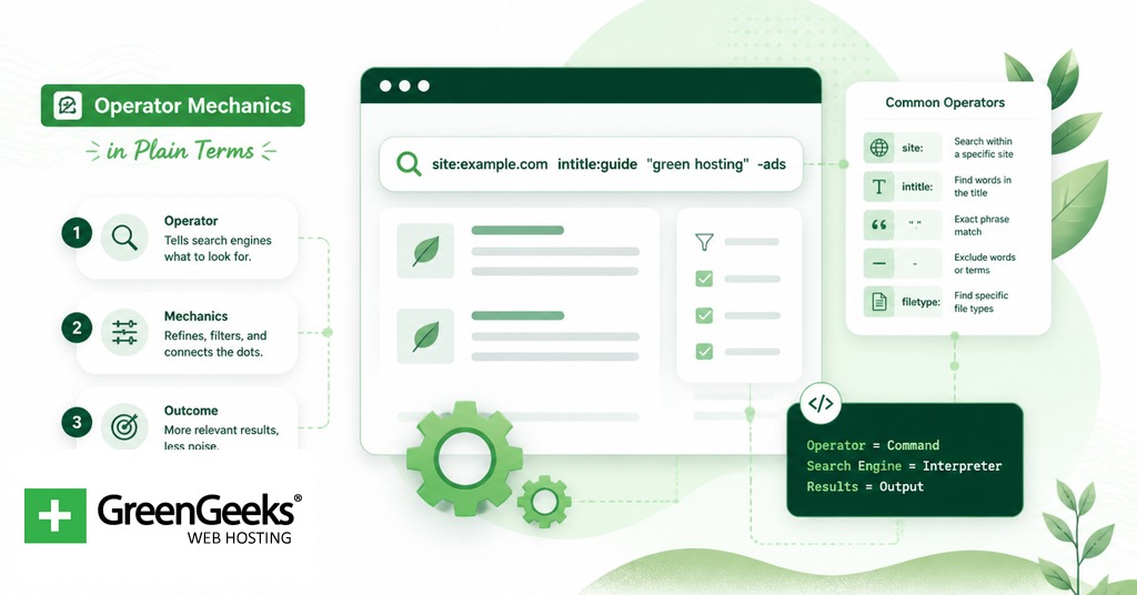
Google search operators are short commands you add to a query to filter results by […]
Google Search Operators: Full List & Examples Read More »
Google search operators are short commands you add to a query to filter results by […]
Google Search Operators: Full List & Examples Read More »
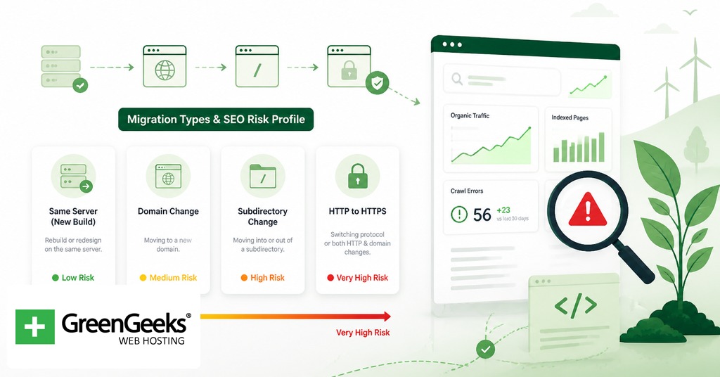
A safe website migration depends on one decision more than any other: every indexed URL
Website Migration SEO Checklist for a Safe Transfer Read More »
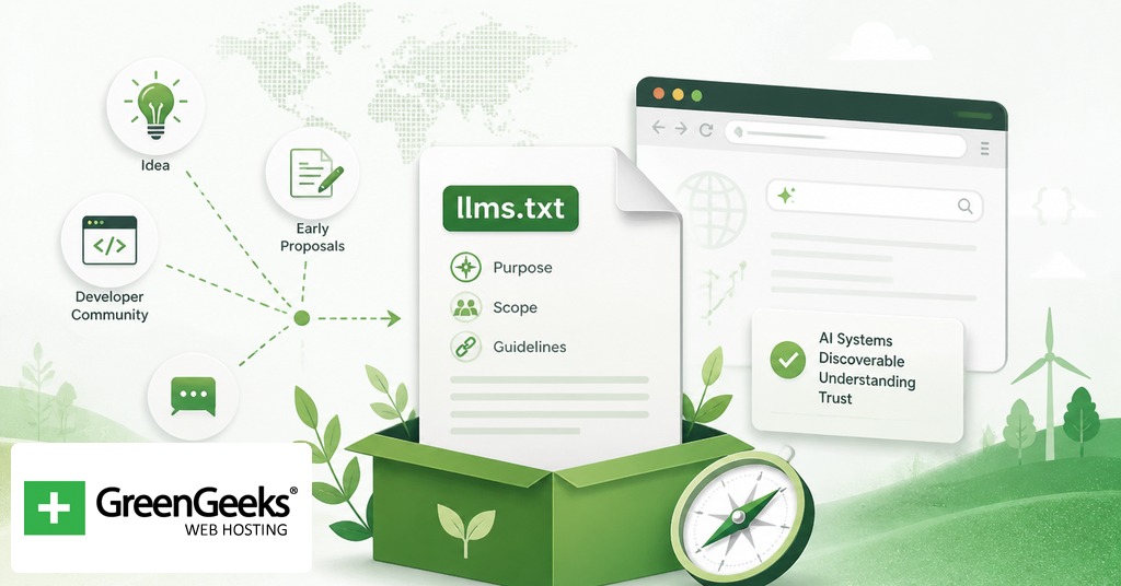
llms.txt is a markdown file proposed in September 2024 by Jeremy Howard of Answer.AI as
What Is llms.txt: Does It Work & How to Add One to Your Site Read More »

You have a domain name and want to know its real value. Maybe you registered
Domain Name Worth: How to Find Your Domain Value Read More »

At the end of every website address, you’ll see a few letters after the last
What are TLDs? How to Pick the Best One for Your Business Read More »

Many marketing experts can attest that email marketing services are one of the most cost-effective
17 Best Email Marketing Services for Small Businesses Read More »

Search engines process billions of queries each day, and businesses need their websites to appear
Are AI-built Websites Optimized for SEO? Read More »

Your analytics dashboard may show hundreds of visits each day, yet your inbox stays quiet.
How to Boost Your Lead Generation in WordPress Read More »

Bing Webmaster Tools is a free service provided by Microsoft. It allows website owners to
Guide to Mastering Bing Webmaster Tools Read More »

Squarespace is one of the most popular website builders on the internet. It provides users
Squarespace SEO: 10 Tips to Optimize Your Website Read More »