What Is an iFrame? HTML Tag Uses and Examples
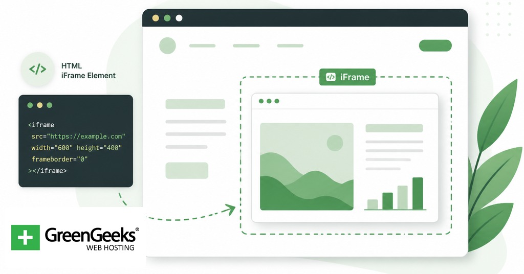
An iframe is an HTML element that embeds another HTML document inside the current page […]
What Is an iFrame? HTML Tag Uses and Examples Read More »
An iframe is an HTML element that embeds another HTML document inside the current page […]
What Is an iFrame? HTML Tag Uses and Examples Read More »
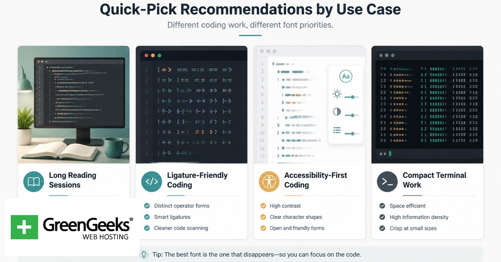
JetBrains Mono leads most short lists for low-strain coding fonts because of its tall x-height,
The 15 Best Coding Fonts to Reduce Eye Strain Read More »

You probably learned to code the traditional way, typing out functions line by line, debugging
How to Build a Website with Base44: Vibe Coding 101 Read More »

Building a website can now be accomplished without extensive coding knowledge or hiring large development
How to Build a Website with Replit: Vibe Coding 101 Read More »

Writing code previously required learning programming languages, memorizing syntax, and spending significant time on frameworks.
How to Build a Website with Lovable: Vibe Coding 101 Read More »

Building software once required years of programming knowledge and many lines of manually written code.
Replit vs. Lovable: Which is the Better Vibe Coding Platform? Read More »

Developers who use AI to write their code face a specific problem. Nearly half the
5 Ways to Secure Your Vibe-Coded Website Read More »

The code editor market is growing at a rate of 12 percent each year and
The Top HTML Code Editors You Should Be Using in 2025 Read More »

Margin and padding are basic CSS layout tools. Margin creates outer space around an element.
Margin vs Padding: Understanding CSS Spacing Read More »

In a world that heavily relies on the digital space, building an eco-friendly website can
How to Make an Eco-Friendly Website Read More »